
Much has been written about question types, especially in classroom lessons when they are most often related to higher-order thinking skills (HOTS). The Q-chart is one example of a tool used to illuminate some of the different assumptions carried by the choice and wording in a question.
I spent a lot of time generating and revising survey questions. It began with a brainstorm; every question about technology or tech-related teaching I could think of went into a list that I imagined I would eventually sort into categories. As late as the third draft of the question set, I was still sifting through questions like “Which web browser do you prefer?” and “How often do your students generate work products in class to be printed?”.
Leanne helped me refocus my questions by teaching me a few important lessons about research survey principles and how to decide what you want to measure.
High Value – Medium Complexity
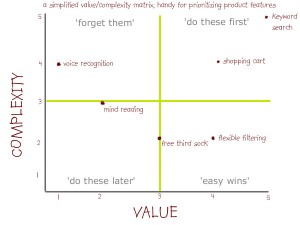
This chart of Value and Complexity is a sample I looked at to do with mapping product features. The idea was that questions can be easy or complex to answer and can provide information of high or low value. I should be asking questions that provide high value information while moderating the complexity to suit the audience.
“What web browser do you use?” is easy to measure and might be interesting, but does not offer strategic value to our survey results. Overall, our aim is to establish a baseline for measuring our school’s Integration of Technology
Double-Barreled Questions
“How frequently do you use create screencasts and lesson PDFs for all students to access before class?” This is an example of a double-barreled question because it has too many parts combined into one single question. Perhaps you often create screencasts but only some students watch them. Perhaps you provide PDFs but not screencasts. I had a number of questions that needed separating. This created more questions, which links to another problem: the issue of survey psychology and fatigue.
Survey Fatigue impacts response rate and validity
Since our school discovered Google Forms, there has been a sharp increase in the number of surveys that staff and faculty are asked to complete. These range from a Grade 5 survey about Healthy Eating or a Grade 10 survey about Issues from the Native Studies course to a Professional Development Topics survey or a signup for Community Service Day supervision.
As our school is planning to implement VPP for its iPad apps, for example, a survey went out asking for feedback on the paid apps we currently own. Response rate was very low. So part of the ‘launch’ of this survey would need to include attention-getting information about the survey and its requirements, requested completion date, etc. Incentives like a gift card draw for early completion are difficult to offer for an anonymous survey because you can’t put names into a hat when you don’t know the names in the first place. I decided to share certain live-update statistics from part of the demographics section of the survey. Our faculty laptops are split 50/50 Mac and PC, so I could broadcast results that said there was a 42%/58% split across Mac/PC respondents and that might incite a competitive spirit to respond more readily to the survey. It did.
Final Anatomy of the Programme Survey:
- Section 1: Tell us about yourself (5 questions) – Demographics
- Section 2: Attitudes & Beliefs (3 questions) – Universal
- Section 3: Practice / Use – By Faculty (5 questions) – school-wide
- Section 4: Practice / Use – By You (10 questions) – per faculty member
- Section 5: Skill Matrix (15 questions) – individual usage
- Section 6: Resources & Tools (11 questions) – school tool feedback
- Section 7: Opinions (5 questions) – general school feedback