Over the last few months I have formally talked with most of my colleagues in the RSGC Senior School about how our school uses technology. RSGC has had a 1-1 laptop program using various incarnations of the Apple MacBook for about nine years. Surprisingly, we have never had a coherent program to integrate technology into the curriculum. The RSGC staff culture is fairly horizontal. There is a lot of expertise on staff with no one person assuming the role of “technology integrator”. This culture allows for a lot of innovation and experimentation, but there are some observable gaps in the the faculty’s comfort with and use of technology in the classroom. For a few years I organized a technology-focused PD carousel, using my “big picture” perspective as school librarian to note where interesting and useful tech integration was taking place, and tapping those users for short demonstrations.
As part of my discussions with teachers I asked them to describe the set of skills they wished our boys could leave RSGC with. Two kept cropping up with fair regularity: research skills (as the school’s librarian this made me want to slap my forehead a few times, but that is another story), and the ability to extract meaning from large data sets. This second wish took on a variety of different forms: a better understanding of Excel, a better ability to graph, and a greater ability to interpret graphical information. Science teachers and math teachers raised this again and again. Our geography teachers also touched on it.
The desire for our students to better understand and manipulate data dovetailed with my study of information visualization in a course I was taking for my masters in library science. I am not a math guy by any stretch of the imagination, but I found the course extremely interesting, and I became aware of the increasing use of data visualization to display and interpret large amounts of information.
My action plan focuses on identifying across as much of the RSGC curriculum as possible where there is an opportunity for information visualization, developing systems for instructing students (and teachers) in data visualization techniques (lesson plans, tutorials, handouts, videos, etc.).
I have done a bit of work on this already because of my course, but I would like to further research high school examples of data visualization, research the tools that are available and make sense to use at the high school level, and create demonstrations of how information visualization can be successful across all subject areas -not just the obvious ones like science or mathematics.
I know many of my Cohort 21 peers are science teachers and I think there are some math teachers too. I am hoping to consult with them on a variety of issues – whether they do any visualization work, what tools they use, how they have approached the integration of large amounts of data into their students’ learning. I am hoping some teachers from other disciplines might help identify where visualization could be useful and how to integrate it.
I am not sure what I would produce as a final product – maybe a how to guide?
Information visualization is an interesting field to me because I think it really serves as an example of a 21st century skill. It is about using technology to extract new meaning from what can be an insurmountable amount of data, but it is still intellectually rigorous and demands the development of critical thinking skills. It presents information in a way that takes advantage of technology – visual and interactive. Definitely 21st century stuff.
I love this idea of focussing on data visualization. I try to do a lot of visualization in my history course. In fact, I am using Tagxedo word clouds (tagxedo.com) to help visualize historical research. The more the students reserach and enter the WHO, WHAT, WHEN, WHERE, WHY and HOW, that they come across the larger these repeating words get – this offers a filter of the most historically significant responses.
I’ve also come across this resource from the National Archives, which is helping student to create a visual history for various themes and eras, via diverse creative tools: http://docsteach.org/tools
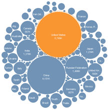
I look forward to discussing this more with you, but one other one that I think is really applicable to social science, geography, math, science, etc… is WorldMapper.com
Let’s chat more about this on Saturday!
I had not seen the National Archives suite of tools before. That is pretty cool. I have seen some other examples of visualizing concepts. I guess Wordles are that kind of thing at its most basic.
I probably didn’t get across that one thing I would like to explore is the use of data in the humanities and social sciences – actual numbers. I am not sure if that is too high level of secondary education or not. I would like to figure that out.
Tim,
Data literacy is so important and a worthy action plan.
Here is a video to get you excited – http://vimeo.com/29684853
An article to push your thinking forward. http://www.smashingmagazine.com/2007/08/02/data-visualization-modern-approaches/
Data literacy is not just the domain of science and math. Art can play a role and so can design. What we are really talking about is communication and how to tell a story visually.
A super TED talk to get you inspired – http://blog.ted.com/2010/08/23/the-beauty-of-data-visualization-david-mccandless-on-ted-com/
and of course we could not talk data without this – http://www.gapminder.org/
Thanks Justin! Just to swap TED videos – If you know McCandless there is a good chance you know Hans Rosling’s classic talk on visualizing global health information:
http://www.ted.com/talks/hans_rosling_shows_the_best_stats_you_ve_ever_seen.html?utm_expid=166907-16